Everything on a mobile/web page is there for a purpose. “Screenless” is the new black. IoT and Augmented Reality bring new challenges for UX/UI designers. The line between the physical and digital worlds keeps getting thinner. What are the user experience design trends that will dominate 2018? Read on to find out!
UX trends to watch in 2018
So far, 2017 has been the year of the mobile-first approach to website development, AI-powered chatbots, microinteractions and the highly fragmented consumer Internet of Things market.
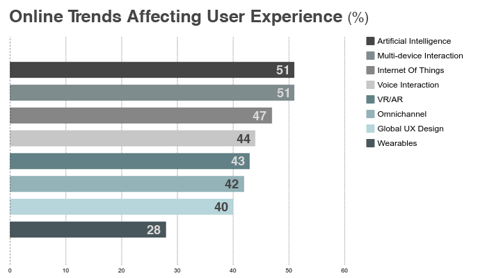
In order to stay successful in 2018 and beyond, UX designers need to think beyond taps and scrolls – and go beyond templates to create memorable experiences on multiple devices. It all starts with the reimagination of the traditional Information Architecture….
Further evolution of Information Architecture
Today’s Information Architecture – that is, the art of organizing app and website content to be more understandable and convertible – is not what used to be five years ago.
There are several reasons for this:
- Information overload. 90% of the world’s data (which is projected to hit 163 zettabytes by 2015) has been created in the past few years;
- Users have become more selective. TV, radio, social media, mobile apps and brand websites are just a few channels that spill data into our lives every day. As a result, modern users have developed a defence mechanism against advertising, fake news and meaningless content – and that’s why influencer marketing now brings 11 times the ROI of traditional digital marketing initiatives;
- Technology adds new levels of complexity to our digital surroundings. Ok, you know Alexa can get you a ride with Uber. Now Domino’s says the smart assistant powers 20% of its one-click pizza orders – and it’s UX designers’ responsibility to create frictionless customer experiences across different platforms.
According to Chase Buckley, a UX evangelist and “usability prophet”, forward-thinking designers should think beyond traditional Information Architecture and just show users what they want them to see right here and right now. To illustrate his point, the UX unicorn cites Stamps.com, a US company that provides Internet-based mailing and shipping services, as a “Disinformation Architecture” pioneer. Stamps UX designers hid all the information regarding user account cancellation while making the sign-up process easy as cake. As a result, the company’s YOY revenue growth has reached 38% this year.
AI to rule them all
And no, 2018 won’t be about chatbots only.
Although we’ve seen some really intelligent and useful website/app bots like Erica (Bank of America) and Marvel’s Facebook Messenger chatbot, it is AI-powered web design solutions and tools enabling brands to manipulate customers’ emotions that shape UX trends for 2018.
Three years ago Facebook conducted the infamous emotional contagion experiment which involved the editing of user newsfeeds with a view to manipulate their psychological and emotional responses. Facebook discovered that a user who saw less positive content posted by the people he followed started to produce less positive content himself!
Through 2018, we will see a wider adoption of synesthetic UX technologies. By studying the data collected with brain wearables like Relax, Emotiv and Muse, tech-savvy designers will be able to create highly responsive website and app interfaces that change color depending on a person’s mood and beautiful ads that evoke certain feelings among their target audience.
Farewell to passwords!
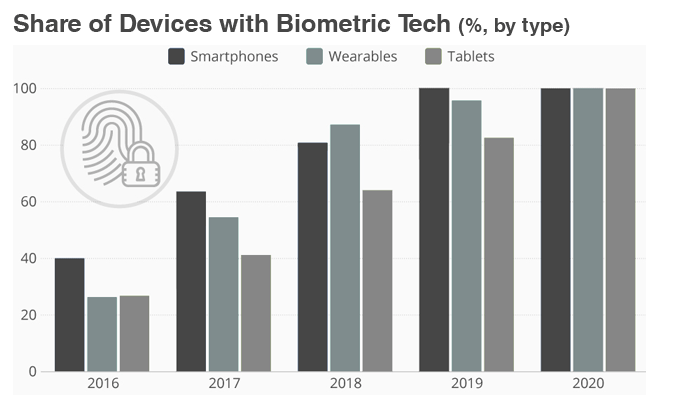
There are currently over 2.3 billion smartphones in use; 30% of these (or 750+ million units) feature biometrics technology. All smartphones that will be shipped through 2018 will make use of the cutting-edge technology, too. By 2020, the iris/face recognition and fingerprint sensor technology’s penetration rate will reach 100%.
The question is, do we still have to make up and remember passwords?
According to Digital Guardian, 70% of mobile and web users have at least 10 different accounts that require a password. The biggest data breaches that happened through 2016 (including those involving compromised IoT devices) stem from weak or reused passwords.
With Touch/Face ID increased adoption, companies that offer software development services will surely have to revise their UX guidelines – and the sooner they do it, the better.
Designing for and with Augmented Reality
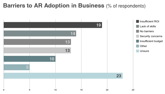
Unlike Virtual Reality that requires dedicated headsets, offers little quality 3D content and lacks UIs and control options, Augmented Reality is totally ripe for adoption.
Here’s the proof:
- We have the tools (ARKit, ARCore, etc.) to design great Augmented Reality apps;
- We have the gear (2.3 billion smartphones);
- We have success stories (Pokemon Go has generated over $ 1.2 billion in revenue).
AR interfaces offer 360 degrees of potential content, thus enabling UX designers to organize information all around you! Mr. Zuckerberg even believes AR will soon replace screens completely!
What are we waiting for?
Triumph of diversity
2018 is the time to retire your dusty old user personas. Period.
You heard right; these fictional representations of your target customers have nothing to do with next year’s reality. What’s more, brands can no longer afford to deal with those ideal customers only!
Here’s an example. You have an online shop selling comics. Your buyer persona (a 19 y/o college student who lives in the dorms, has a part-time job at Dunkin Donuts and collects Spider-Man toys) is the ideal representation of your target audience.
A teenager has no difficulty in using hamburger menus and placing an order via your mobile app – but it doesn’t mean that his grandma, an elderly woman with cataracts who’s looking for a birthday gift for her sweet boy on the Internet can do it, too.
Age-responsive design and the increased role of failure mapping will be the biggest user experience design trends for 2018, and it’s in your best interest to follow them.
Going back to basics
UX designers got way too reliant on templates and common logic (aka Design Thinking). As a result, nearly all the websites, apps and consumer electronics products look exactly the same nowadays. Just think of popular social media apps like Snapchat, Facebook and Instagram that all make use of instant messages and live video stories…and lose that something that made them successful back in the day!
2018’s design will be more about feelings, not templates!
Here’s an example. By getting rid of hamburger menus (btw, these are understood by only 50% of users aged between 45 and 64) in their iOS app, Shopify managed to grow navigation clicks by 30%! There’s also Apple who ditched grids for their incredible iPhone X website to tell a continuous story.
If you’re working on a website, mobile app or connected gadget right now, make sure to put humanity back to your product and sense its usability instead of testing it! It might be easier said than done, though. If in doubt, enlist the help of an experienced software vendor.
So, these are my UX predictions for 2018! Feel free to share yours in the comments section!
This article is published in partnership with R-Style Lab.

